Brand Resources
Logo Versions
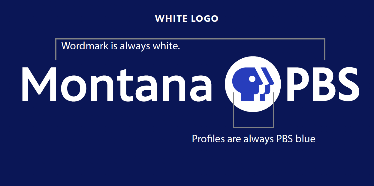
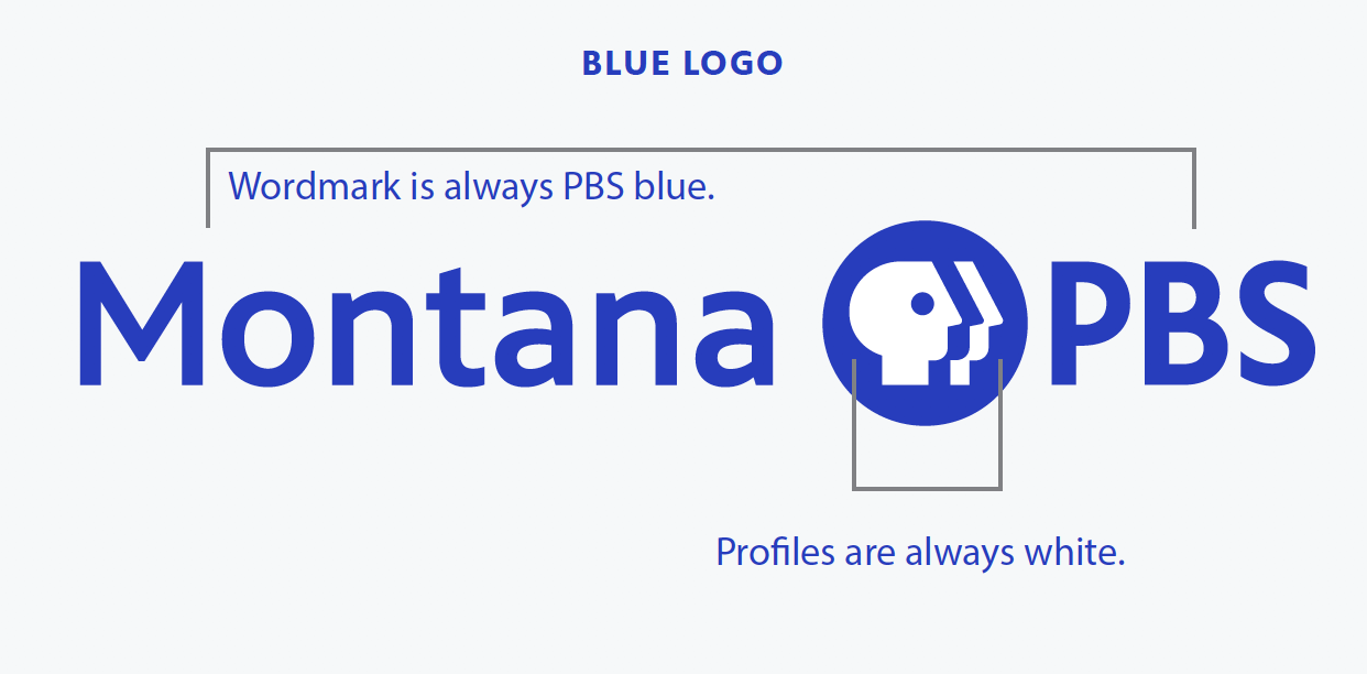
- There are two versions of our logo, a while logo and a blue logo.
- To ensure readability, logo must contrast the background on which it is placed.
- High quality print, embroidery or other production techniques must be used to best retain detail, shape and weight of logo.
- The wordmark was custom-made for the logo only. Do not recreate the wordmark in the PBS Sans font.
Our logo instantly signals who we are - a source of thoughtful and thought-provoking programming for over 35 years. Our iconic shield reflects our diverse community of viewers, gazing slightly upward and engaging with our illuminating content. Our letterforms are modern and highly legible. Their humanist form, scale, and placement take cues from the shield, together forming an inseparable unit and a strong singular brand expression.
Download the Style Guide